The new California School Dashboard is now up and running and has been updated after a trial run earlier this year. Here’s what you should know about the dashboard.
The dashboard covers the following six statewide indicators:
- Smarter Balanced (SBAC) test results in English Language Arts and Math
- English Learners’ progress
- Graduation rates
- Suspension rates
- Chronic absenteeism rates
- Career/college readiness
There is a step by step guide on how to access the website to access information about California schools and how they are performing.
1. Review the Fast Start Guide*. It’s confusing enough to make you want to go to step 2.
2. There is a tutorial video! You can watch the Video Tutorial** here:
3. If you want clarification or translation of the video content, transcription is provided***
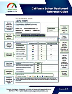
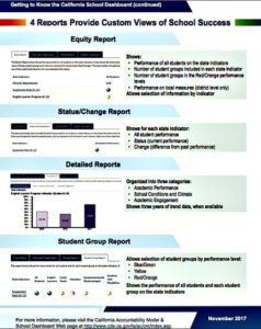
“Welcome to the California School Dashboard. This tutorial will highlight the features of the Dashboard and other resources available on this Web site. When you access the California School Dashboard the first page you see is the Home Screen. This page contains a search bar and links to resources such as the fast-start guide. You can search for a district or school by typing the name into the search bar. Select the Search button and then select the school or district from the resulting list. Once you have selected a school or district, the Dashboard will be displayed on the screen. It displays basic information. There are four different reports on the Dashboard. The first report is the Equity Report which displays the performance level on all state indicators, as well as information about how all students are performing. The Equity Report will also display the local indicators for districts and charter schools only. The other reports can be accessed using the navigation tabs directly above the indicator information. The Status and Change Report shows the status (how schools or districts performed this year) and change (how their performance changed from last year) for all the state indicators. Selecting a state indicator will bring up detailed information about student group performance on that indicator. The Detailed Report shows information about performance over time, up to three years of data are available. The final report available on the Dashboard is the Student Group Report. This report provides the performance levels for all the state indicators across student groups. If you would like to see how all schools in a district are performing on the state indicators, select the List of all schools in the district at the top of the report. It is important to know that charter schools are considered their own districts and will not be included in this list. Thank you for watching this short tutorial on the California School Dashboard.”
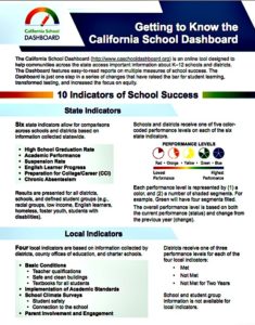
4. Maybe the most useful tool is this nifty and colorful pdf called “Getting to Know the Dashboard”****
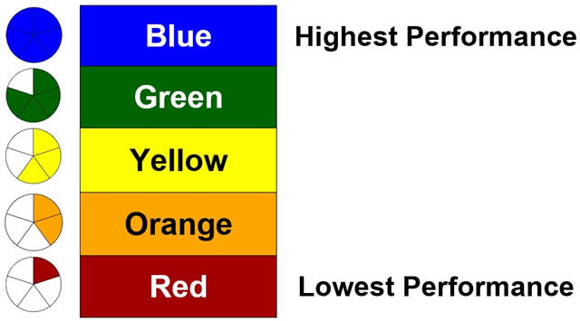
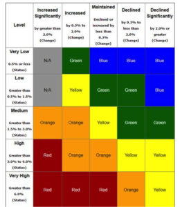
5. The color coded pie charts***** are depicted with slices as to show levels for those that are color blind. For someone with ADHD, like me, that can be distracting. Just be cognizant that the slices are to provide the same information as the colors.
Here are the five levels:
6. The California Dashboard is used to track the progress of schools in California. Results from SBAC testing will be available on the dashboard starting in 2017-2018.
What kind of information do you want on your student’s school? The dashboard will provide answers to many of them. Go to the website to explore its contents.
*Note: Available in several languages via the translate button located on the top toolbar of the website
**Note: Available in English only. Transcription is available in Spanish and other languages.
***Note: Available in several languages via the translate button located on the top toolbar of the website
****Note: Available in several languages via the translate button located on the top toolbar of the website
*****Note: To help users who are printing in black and white, the dashboard translates colors into an icon of a pie, with slices corresponding to colors. Blue, the highest level of performance, is a full pie with five slices, while red, the lowest performance level, is represented by one slice. Orange has two slices, yellow has three and green has four.
Leticia Chavez-Garcia
Latest posts by Leticia Chavez-Garcia (see all)
- Claudia Sheinbaum: Mexico’s First Woman President - June 3, 2024
- Unpacking the Racist Attack by Labor Leader Brigette Browning - May 7, 2024
- Student Vaccine Mandate in California Scaling Back - June 10, 2022
- Siga estos 5 pasos para solicitar un Permiso de Maestro Suplente en California - May 24, 2022
- Early Childhood Special Education Teachers: The Burnout Crisis - May 24, 2022

