The California School Dashboard got another facelift recently and although it is a little easier to navigate (especially on a smartphone) and has added information, I am still not impressed. I would love to get some parent feedback. How many people actually use the dashboard? It’s not that easy to understand, especially if you don’t have an education background. It is color coded, and does have legend explaining what the colors are, but there are two group of folks that I think will still have trouble — people like me with ADHD and other focusing issues and people who don’t speak English. Currently, it is only available in English. The indicates that there will be Spanish translations up and running in 2019.
I mean in 2018. Why can’t we just have a “Hey Siri” type of approach to this? For example, we could ask, “Hey Dashboard, tell me about Martin Luther King Middle School in Los Angeles…” and then it could answer with things like, “MLK MS in Los Angeles is the lowest performing school in the district. Only 25% of the students are proficient in Math and English. You should seriously consider options for your kid!” Wouldn’t this be easier?
The California Dashboard went live in March of 2017 and has been using colors to rate schools from best to worst. There were so many complaints by parents and advocates that the state has spent more than $300,000.00 to try and address some of the issues that were causing confusion.
I encourage you to read the story in LA School Report on the new and improved California School Dashboard and then try it out yourself.
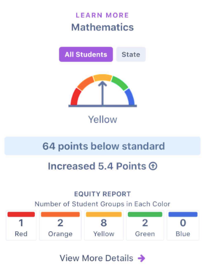
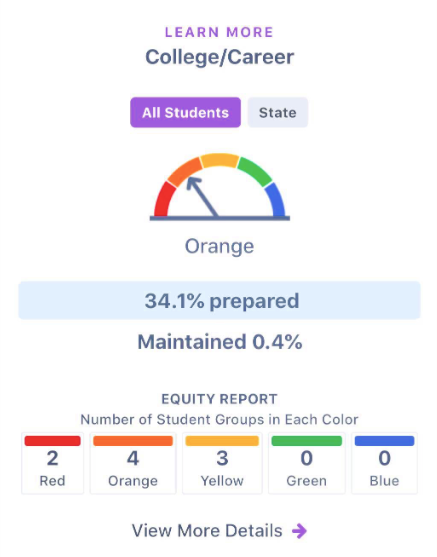
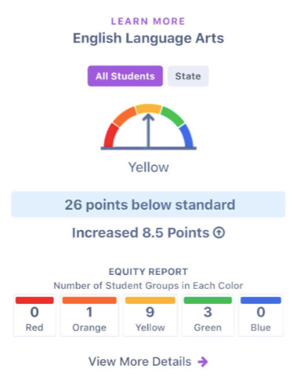
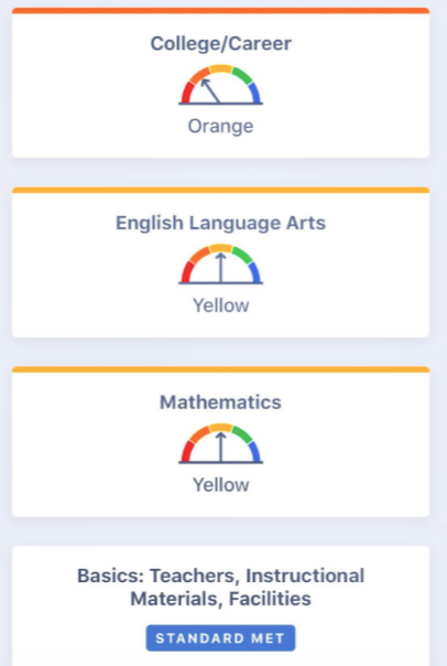
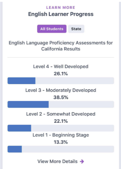
Here’s some information I pulled up on San Bernardino City Unified School District:
Even with these graphics, I’m still wanting to know more and would prefer something that is more concise to explain how well a local school or district is performing.

